(Case study) — Selected work

Year
2024
Location
London, UK
Role
Photography and set
Format
Launch — 6 images
(Brief)
The Problem

For Ember, the creative challenge was to translate an invisible sensory experience into an understandable visual story. We approached the work as a question of brand expression: what should a viewer notice first, and what should stay with them afterwards? Rather than making every image do everything, our draft direction starts with a focused visual idea that can connect the whole story.
Brand Strategy
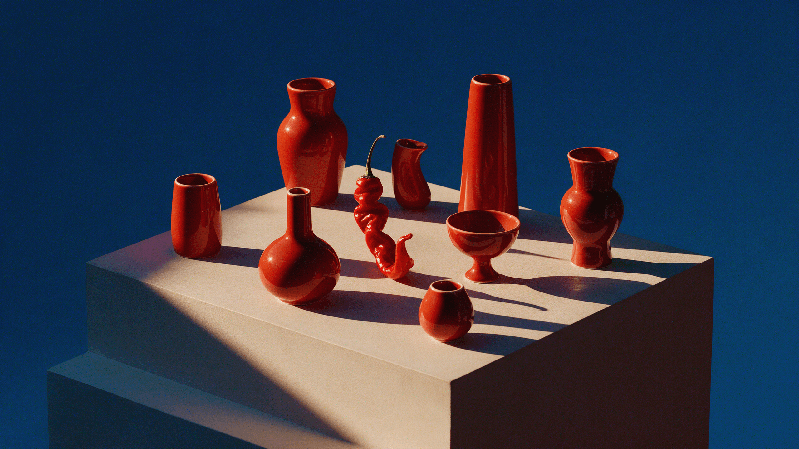
The organising idea was the meeting of smoke, citrus, glass and glowing embers. This gives the project a clear point of view before individual compositions are considered. For a branding client, that distinction matters: a visual system should express an intention, not simply a collection of preferences. Here, the concept creates a consistent reference point for colour, atmosphere and image selection.
The Process
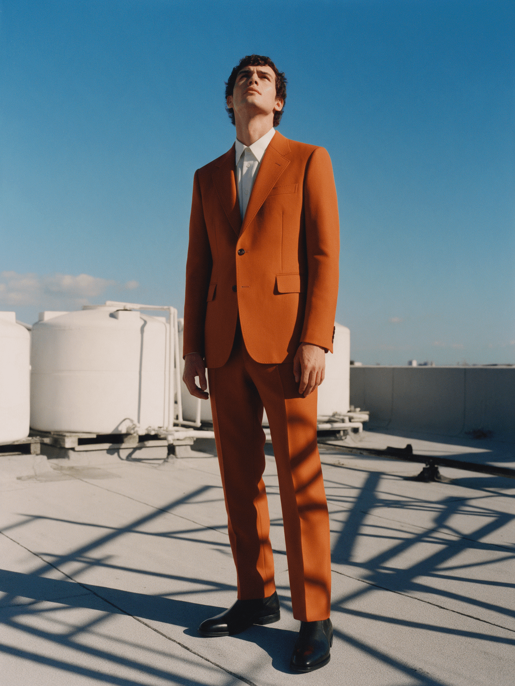
The practical approach centred on a restrained still-life set and a slow exposure. A fragrance that smells of smoke and oranges, translated into glass, embers and a single slow exposure. These constraints provide a useful framework for understanding how the work was made. Each image can explore a different moment while remaining connected to the same creative premise.
Creative Development
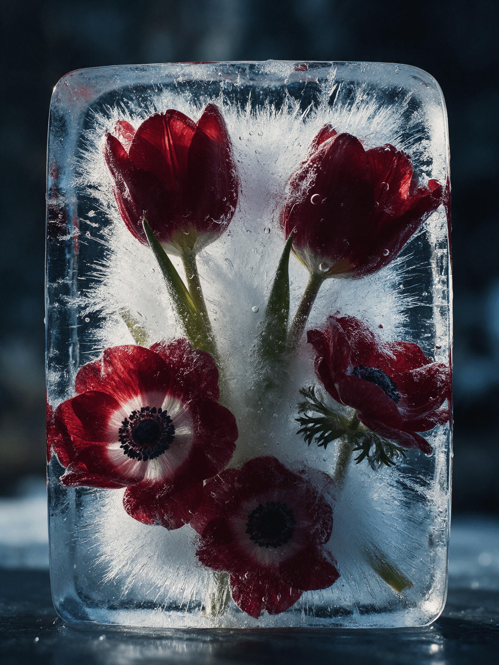
The key visual relationship is the balance between the clarity of the bottle and the atmosphere around it. We use that relationship to explain how individual choices support the larger direction. Framing, pacing and emphasis should reinforce the idea rather than compete for attention. This section is an editable account of the creative reasoning, ready to be refined with the actual decisions and iterations from the project.
The Solution
The direction for Halden brings the work together through a repeatable visual language. The goal is coherence without sameness: retain the characteristics that make Ember identifiable, while allowing enough variation for the story to develop. The images below and throughout the case study illustrate that relationship between an overall concept and its individual expressions.
The Outcome
Ember demonstrates how a focused idea can connect strategy and execution. The value for a brand lies in making the creative direction easier to recognise, explain and apply consistently. This is a qualitative draft, not a claim of measured business results. Replace this section with the final deliverables, client feedback and verified outcomes when those details are available.
View live website
(Credits)
Set design — Studio Calda
Props — Ash and Oak
Retouch — Lumen Post
Next project ↗

Based in
Lisbon — PT
New York — US
© 2026 Ines Varga
Template — Vane